detached.
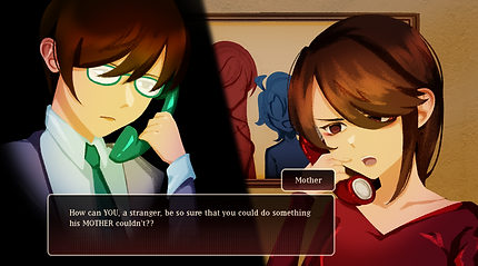
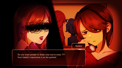
As a concept, "detached" is an RPG Visual Novel in which players control a mother who is trying to get her hikikomori son to leave his room through different methods of recovery.
The concept was then made into a deliverable product (video game trailer) and marketing campaign was made to promote the product.
Skills learnt includes; Illustration, motion graphics, & graphic design.
Deliverables
Showcases the Final Product (game trailer) and its Promotional Collaterals (marketing campaign strategy).
01
case study video
A quick run-down introducing the project's concept and ideation, including the game and related events.
02
detached. | game trailer
A trailer meant to promote the game, showcasing bits and pieces of the story and gameplay.
Event Invitation

03
social media
Further information and marketing about the game and events are distributed through our Instagram.
The aim of the campaign is to promote awareness of hikikomori's, and to provide a safe space for hikikomori's and their loved ones to gather and understand the concept better.
The product would then be shared and used as a way for the campaign visitors and hikikomori's to connect with one another.
Event Information


Merchandise Catalogue


04
merchandise design
Promotional merchandise distributed in the event.
Art Prints

Clear Photocards


Merchandise Catalogue


Production
Showcases the production stage of the final deliverables.
01
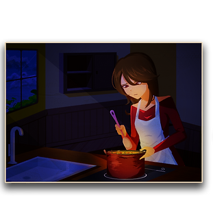
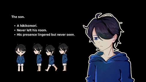
character design
Character sprites and their in-game turnarounds.


02
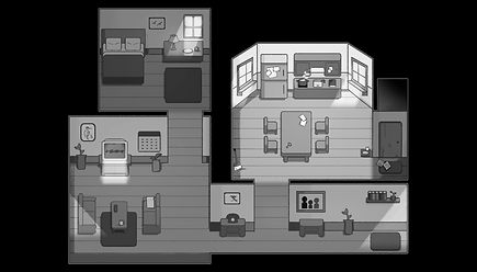
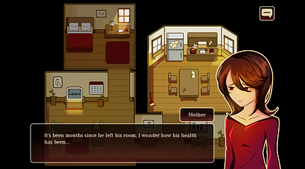
map design
The map design changes in different moods and times throughout the game. The story takes place in one simple and small location: the family home.
The map feels relatively small to give off the "claustrophobic" vibe, making it seem comfortable but also weirdly unsettling.


03
game UI & illustrations
Screenshots and illustrations used and displayed in the game and its trailer.

04
font study
The font, Lo-Res 21 OT, is used for the majority of the game's text UI and logo title. It was chosen due to its pixelated look, giving it a vintage feel. Yet, it also feels unique, and serif fonts are often associated with formality, matching well with the vibe of the game.
The logo title does not use capital letters for the vibe of "familiarity" and a simpler aesthetic, as the game revolves around a family duo. Yet, the serif font and proper full stop balance the informal feel, reflecting how both the family has grown distant and "unfamiliar".